Predicting Price of Used Cars in Chicago
July 2019 »This is the second project I completed as part of Metis Data Science Bootcamp.
Introduction
My friend mentioned that he wanted to buy a Tesla. I was intrigued because he already owns a used Lexus. Apparently, my friend wants to sell his Lexus so he can buy a Tesla Model 3. This got me thinking about my next project: can I create a linear regression model that predicts the price of a used car in Chicago? My friend can benefit from that model by finding the optimal price to list his car at.
Project Overview
This project is broken down into the following
- Where do I get used car data in Chicago?
- What trends can I spot? What features can I use for my model?
- What can I do to improve my model (cross validation, ridge regression, lasso regression)?
Data Extraction
I used Autotrader to fetch 1000 used car postings. I used Beautiful Soup, Selenium, and Thread Pooling/Multithreading to web scrape the data. If you want to learn more on how I used multiple threads to scrape data, check out my blog post here.
Exploratory Data Analysis
I’ve noticed two key observations when exploring the data set.
- Cost is positively skewed
- Some of the outliers contributing to the skewness are new/like new luxury cars ranging from $53,000 - $95,000
For predicting a used car, it doesn’t make sense to include luxury cars that are like new/new. I decided to remove those outliers that will affect my model significantly. Hence, I made sure that the max cost of the car in my data was $53,000.
Even then, the car cost still had a positive skew. I decided to use a log transform (ln) on cost to get a normalized version of that category.
| Cost | LogCost |
|---|---|
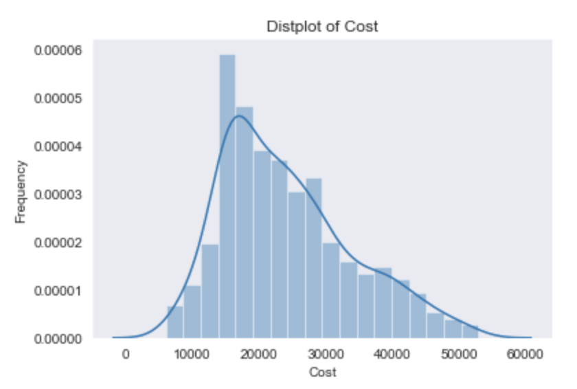 |  |
From here on out, I created a model to predict against LogCost.
Feature Engineering
Feature Selection
My dataset included only 4 numerical features to help me predict LogCost: MPG City, MPG Highway, Age, and Miles. To get creative with my features, I had to explore other categorical data (Make, Color, Drive Terrain, Certified, Engine), and come up with my own quantitative features based on my exploration.
Below is a box plot of the cost of the car sorted by their make.

Here you can immediately see that luxury and foreign brands contribute significantly to the cost. I decided to keep track of whether a car is a luxury brand and foreign brand. I also made dummy variables out of car make to see if certain brands affected the cost.
Below is a histogram of cars sorted by their colors.
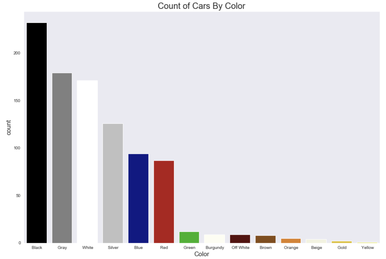
The frequencies suggest that black, gray, white, and silver are popular colors. Red and Blue are semi-popular colors. The rest are unpopular. I kept track of which colors are popular to see if that impacted the cost of the car.
Below is a box plot of the cost of car sorted by their drive terrain.
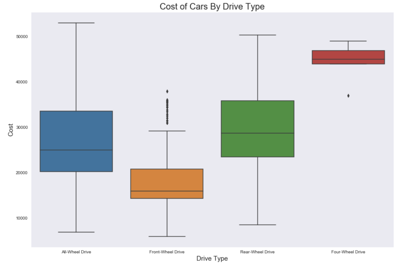
It seems that different drive terrains impact the cost of the car. So I made dummy variables out of them.
Added Features
Age x Miles
Age and miles have a close linear relationship. Below is a graph that indicates such.
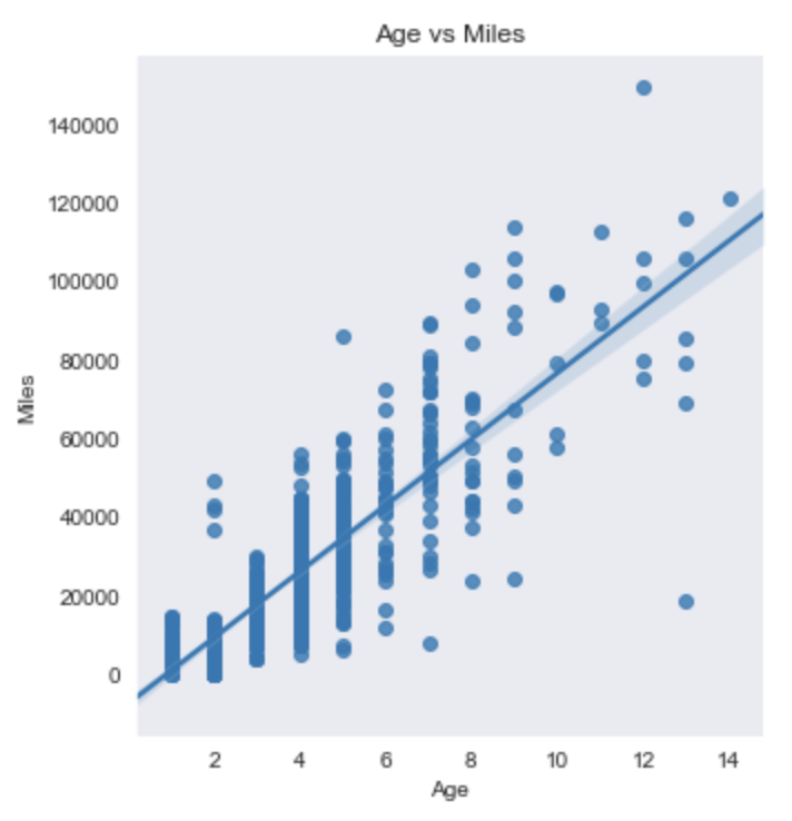
To avoid multicollinearity, one of those features needs to be removed. But age and miles are very important to predicting car cost. I decided to add an additional feature that combined those terms into one (Age x Miles). This feature can help me target some outliers (newer used cars or very old used cars). Later on, I can see whether one of the three features needs to be removed for improving model performance.
Certified x Luxury
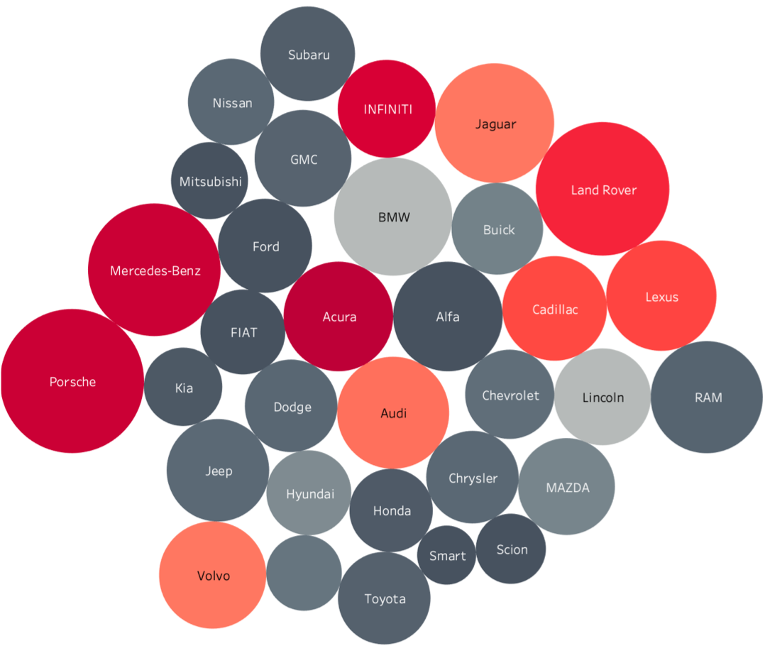
A certified car is a car that has no more than 60,000 miles, is no older than 7 years, has a great engine, and is in great condition. I wanted to combine that with luxury so I can penalize cars that have high maintenance. Example: A BMW is a luxury car, but requires high maintenance after 3-5 years and rarely achieves certification status. I felt this information would be useful for my model.
Below is a visualization of certified x luxury. To interpret this bubble plot, I’ve listed the metrics as well.
- The empty circle is a Volkswagen
- The bigger the circle, the bigger the average cost of the type of car.
- Dark gray has little to none certified x luxury value. Light gray has below average certified x luxury. Light red has above average certified x luxury. Dark red has the highest certified x luxury.
Removing Featuers
Below is a heatmap of all my features, excluding car make.

I noticed that MPG Highway and MPG City have a strong correlation, and including both includes multicollinearity in my model. I ended up removing MPG City from my model.
As mentioned before, Age and Miles have a strong correlation. I’m not sure which one to remove at this point, so I kept both in for now.
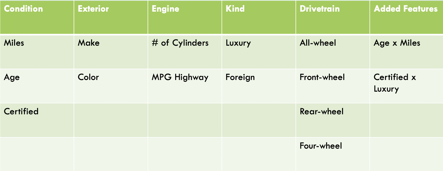
Complete List of Features Used for Model
Linear Regression
Results
Using OLS to remove features with high P-values and cross validation to determine the best linear model, I was able to achieve a linear model with an adjusted test R^2 of 0.87. This linear model included all features except for Foreign (a big surprise in my findings, as foreign cars are popular), Popular Color, Make_Fiat, Make_Mitsubishi, and Make_Smart (the latter 3 are dummy variables from my Make feature. So this shows that the cost is not impacted if a car is a Fiat, Mitsubishi, or Smart).
I was surprised to find that the model found age, miles, and age x miles important features to include. My model may have a bit of multicollinearity, but it has a high R^2 regardless.
The root mean squared error (RMSE) of this model is $3,465.88. So whatever prediction my model makes, it will be off by $3,465.88.
I was pleased with this R^2, but wondered if I could make this model better. Were there other features that needed to be penalized? Am I removing the correct features? I used cross validation and ran both a Ridge and Lasso Regression models to see if adding a penalty term improved my model.

Despite the penalities, both ridge and lasso didn’t improve my model. So my linear model was the best of the three.
Checking for Homoscedasticity
While I was pleased with my model, I wanted to check if my model was homoscedastic. In other words, the random variables of my model had the same finite variance. If there was a pattern in the residuals of my model, then the error variance changes proportionally with a factor. This factor might be a missing feature I forgot to include in my model, or a sign that linear regression may not be the best model. Below is a residual plot of my data.
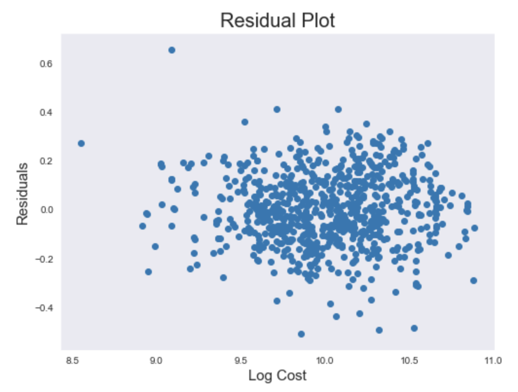
This implies no patterns, so my model is homoscedastic.
Conclusion
I was able to create a linear regression model that predicted used car prices (as long as the price wasn’t above $53,000). I then used this model to predict the price of my friend’s car. My friend has a 2015 Burgundy Lexus RC 340 AWD, with 55,000 miles, 26 MPG, All wheel drive, and 6 cylinders. With this information, my model predicts the price of $26,902.54. However, I have a RMSE of $3,465.88. I suggest to my friend that he adds that offset to the predicted cost, and price his used Lexus at $30,368.42.
If he is lucky enough to sell the car at that price, my friend is still a few thousand dollars shy of buying a new Tesla Model 3.
